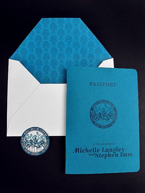
My co-worker Michelle is getting married within the next two weeks and at the end of last year I bugged her into letting me design her one. They already had a bit of an idea of the theme they wanted; their journey. After a few discussions it was decided to let their travels be part of the inspiration, so the invitation was to be a passport to their wedding.
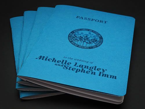
Michelle's favourite colour is teal, so the colour theme for the wedding was to revolve around teals and turquoises. She found this amazing teal card in a scrapbook store, that had a line grain texture on one side, which turned out to be perfect for the cover of the passport.
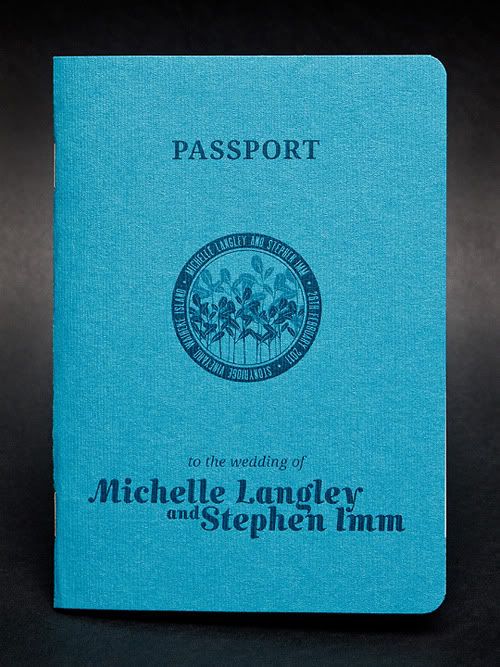
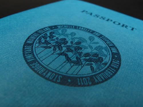
The story of how Michelle and Steve got together is a sort of on-going joke with their friends... When they first got together, Steve wowed Michelle with his vast knowledge of mangroves. Yes. Mangroves. They wanted to have a mangrove design somehow incorporated into the invitation, since that is where their journey began, so I designed a circular stamp style motif that contained Michelle's mangrove design to go on the front of the passport where the coat of arms usually goes.
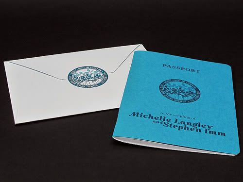
We really struggled to find a nice teal envelope to match the card on the cover of the invitation, so I designed a custom envelope that we could make up ourselves, that way we could print the addresses and sender details directly onto the envelope fairly easily.
Michelle used a victorian style floral pattern on their engagement party email invites, which I've used as a pattern on the inside of the envelope. I found the closest teal I could get to match the card cover and then used a darker teal to print the pattern over top.
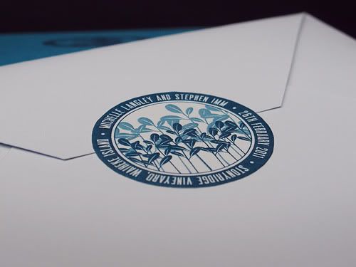
Just to make the envelope a little more interesting, using the circular motif, we made little stickers to seal the envelopes (saved us having to double sided tape everything!).
The Fiskars circle cutter is a godsend!
So getting to the inside of the passport...
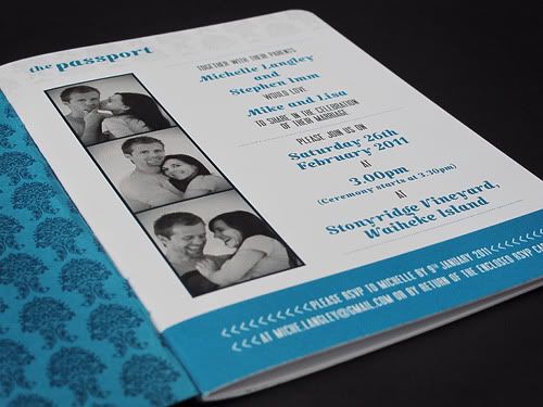
I used that same floral pattern on the inside of the cover and as a very light background in the headings of each page.
The first page of a passport is always in a landscape format but I decided not to go with that format, due to the amount of info to go on this page. I wanted to retain the whole photo idea, so Michelle took some fantastic photos of her and Steve which I set up in a photobooth style.
They look adorable!
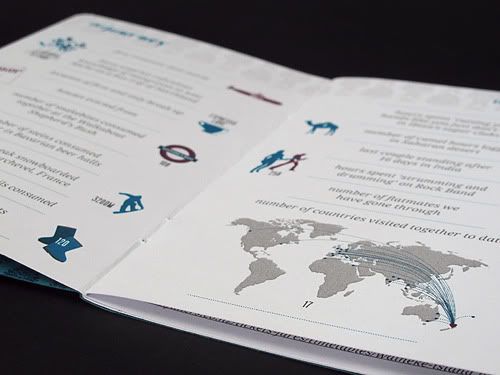
One of the more important (and fun!) parts of the invite was The Journey spread. Michelle and Steve put together a whole bunch of stats about their 10 years together including the number of parisian snails consumed, hours spent in gumboots at music festivals and first romantic date movie they saw together.
They've visited 17 countries in their travels together, wow! That deserved it's own little map to show those countries that they've been to and a little heart to show where they are now.
Since they are getting married on Waiheke Island, a location map was definitely needed. The guests have to ferry from Auckland to the island and either bus or taxi to the wedding venue. Also shown on the map that I designed are the locations of the beach and the venue for the brunch the following day. I used little icons to depict each place.
(There was also a spread containing all of the extra information which I haven't shown here, but it contained info about children at the wedding, gifts, accommodation suggestions, the brunch, transport and the ferry timetable.)
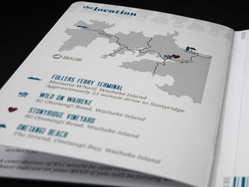
I designed the RSVP card to look like a boarding pass (to compliment the passport!) and instead of having it as a loose card that went with the invite, we decided to keep it intact with the booklet. Having just bought a perforator cutter, this decision was the best of them all.
The back of the RSVP card had the light floral patter on it, with the return address to Michelle and Steve and an area for a stamp. It was super easy to just tear down the perforation, tick the appropriate boxes, pop a stamp on it and chuck it back in the post. Loved it!
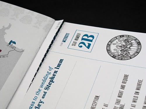
There was a fair bit of info to fit onto the card as they needed to know if people needed transport and would attend the brunch the following day and that sort of thing, but it all worked really well.
I designed a teal barcode, since all boarding passes have those, and made the flight number Michelle and Steve's initials and wedding date, MS260211.
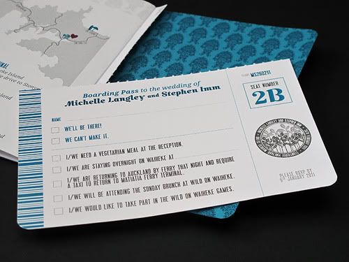
The final result looked amazing. I was really pleased with how it turned out and Michelle and Steve loved it. Since it's been sent out they've had heaps of compliments on it, which is fantastic to hear!
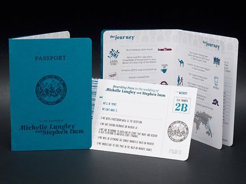
So, I hope you all like it! Such a big invitation for my first wedding invitation design job but it turned out exactly how I imagined it would be. So so so pleased!
6 comments:
This is so cool! I'm inspired by your creativity :)
wow this certainly is an amazing invitation! I love the concept and is so fitting for the charming couple. thank you for sharing! I love all the details includign the lined envie.
This is such a smart idea, I really love it!
These are absolutely fabulous! Do you take orders? If so, I'd like to use these for my wedding next year. Please let me know.
Thank you!
Angelyn
This is a smart idea and a booklet kind of wedding invitations could be liked by very few of them. Because somebody like more simple than this, even though a small type of booklet in nice for looking.
This is an amazing idea and a booklet kind of wedding invitations in New York could be liked by very few of them. Because somebody like more simple than this, even though a small type of booklet in nice for looking.
Post a Comment